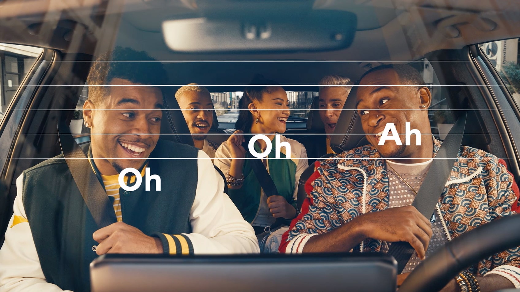
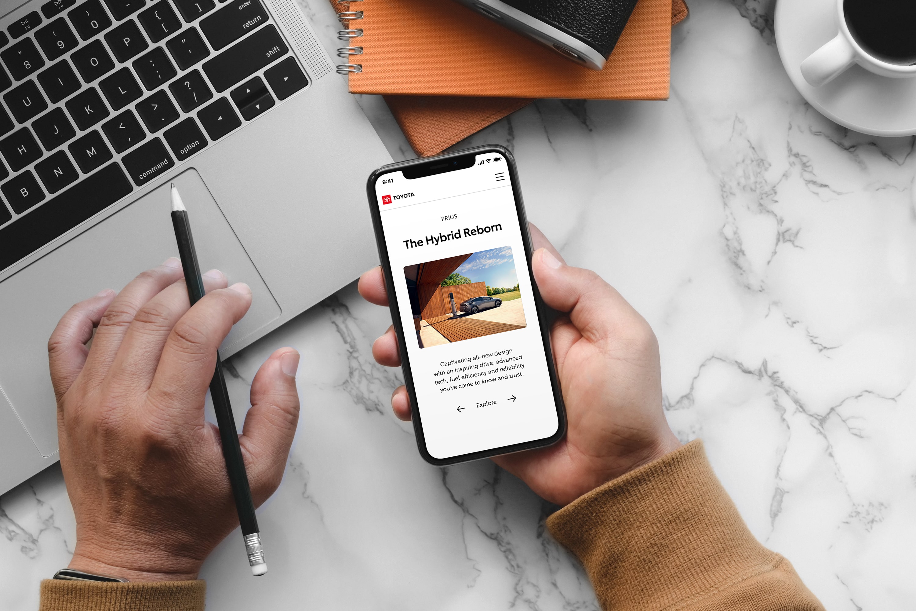

Emotional Connection
Focusing on emotional storytelling creates a more meaningful and memorable brand.

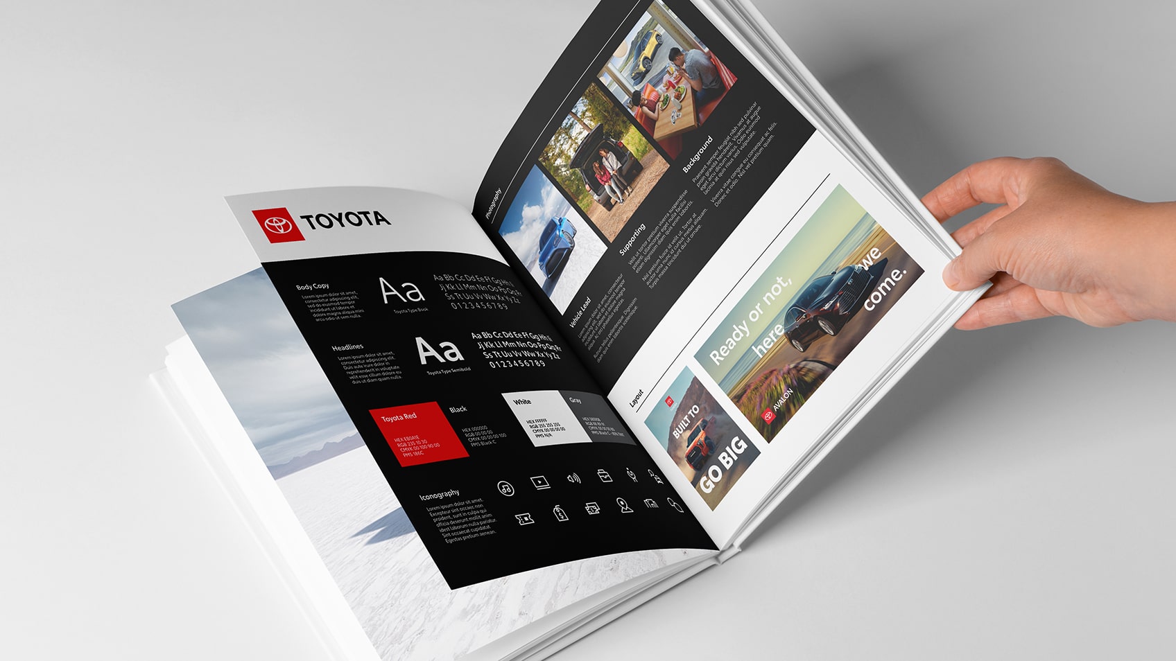
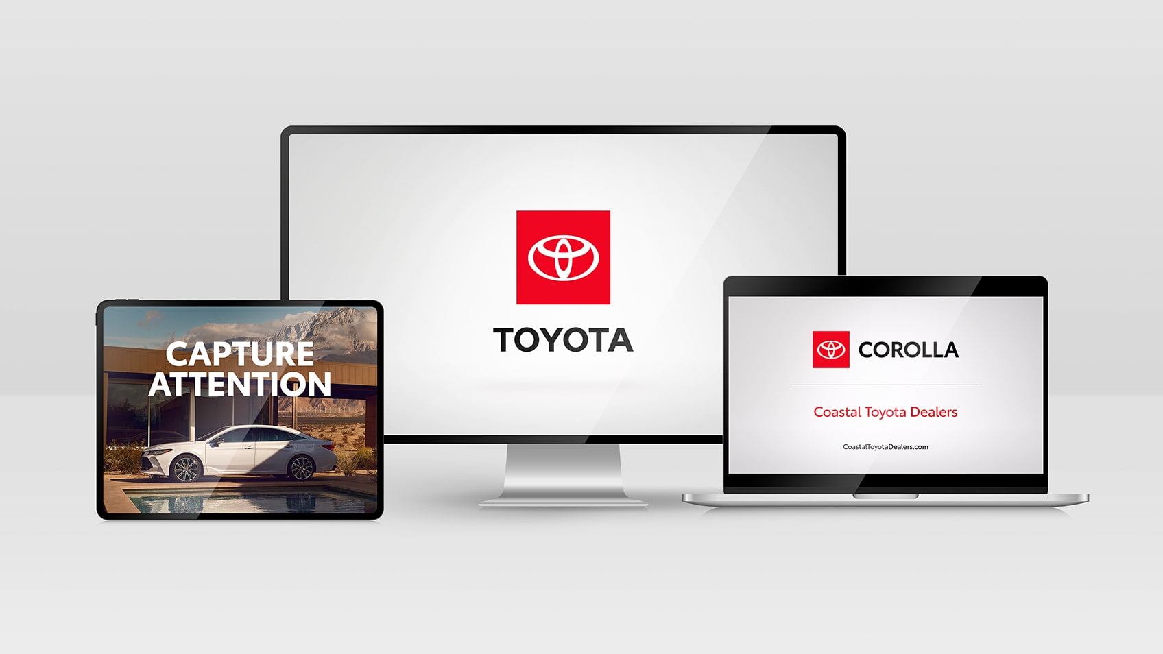
Consistent Application
Using brand elements with consistency reinforces our message and builds trust.

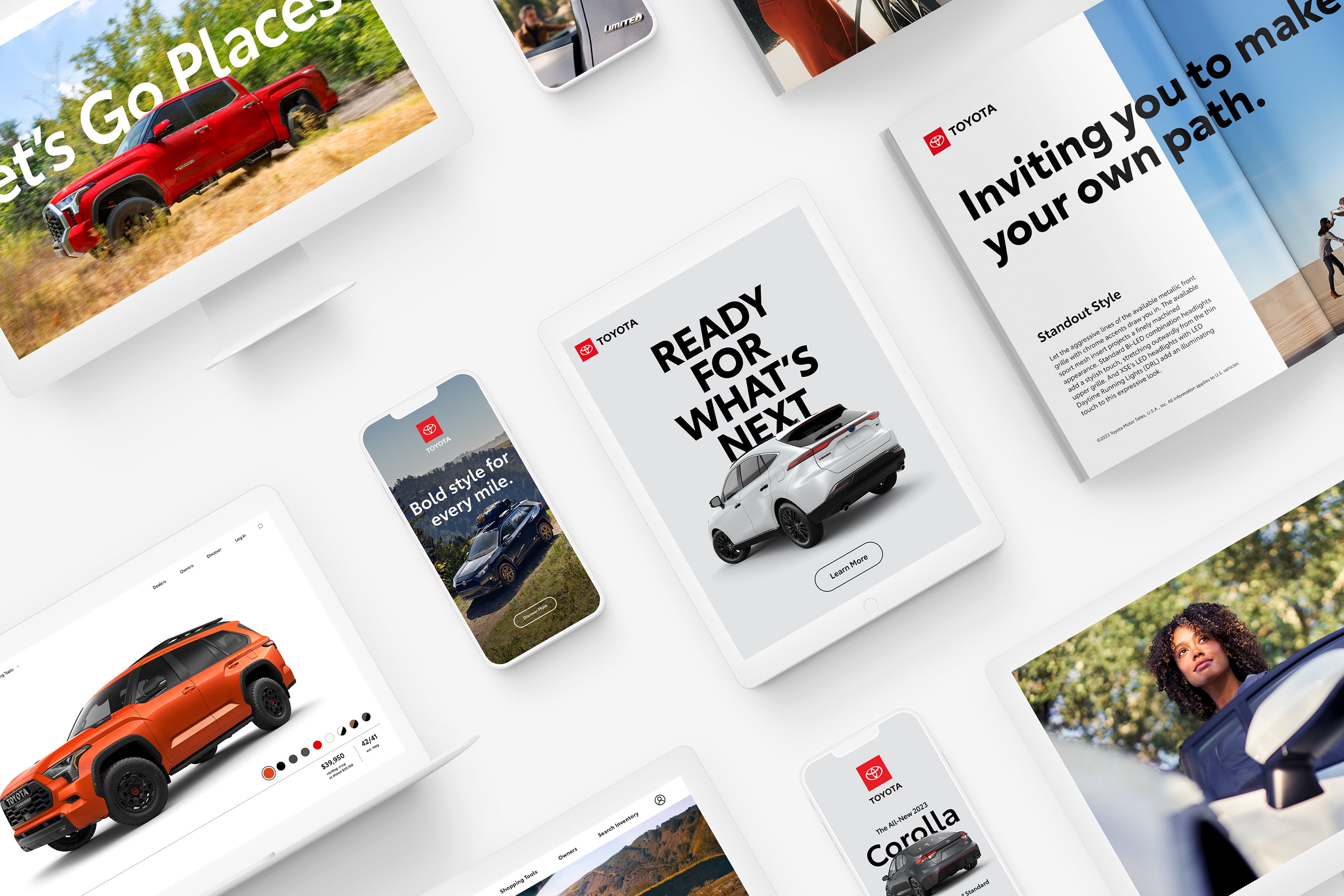
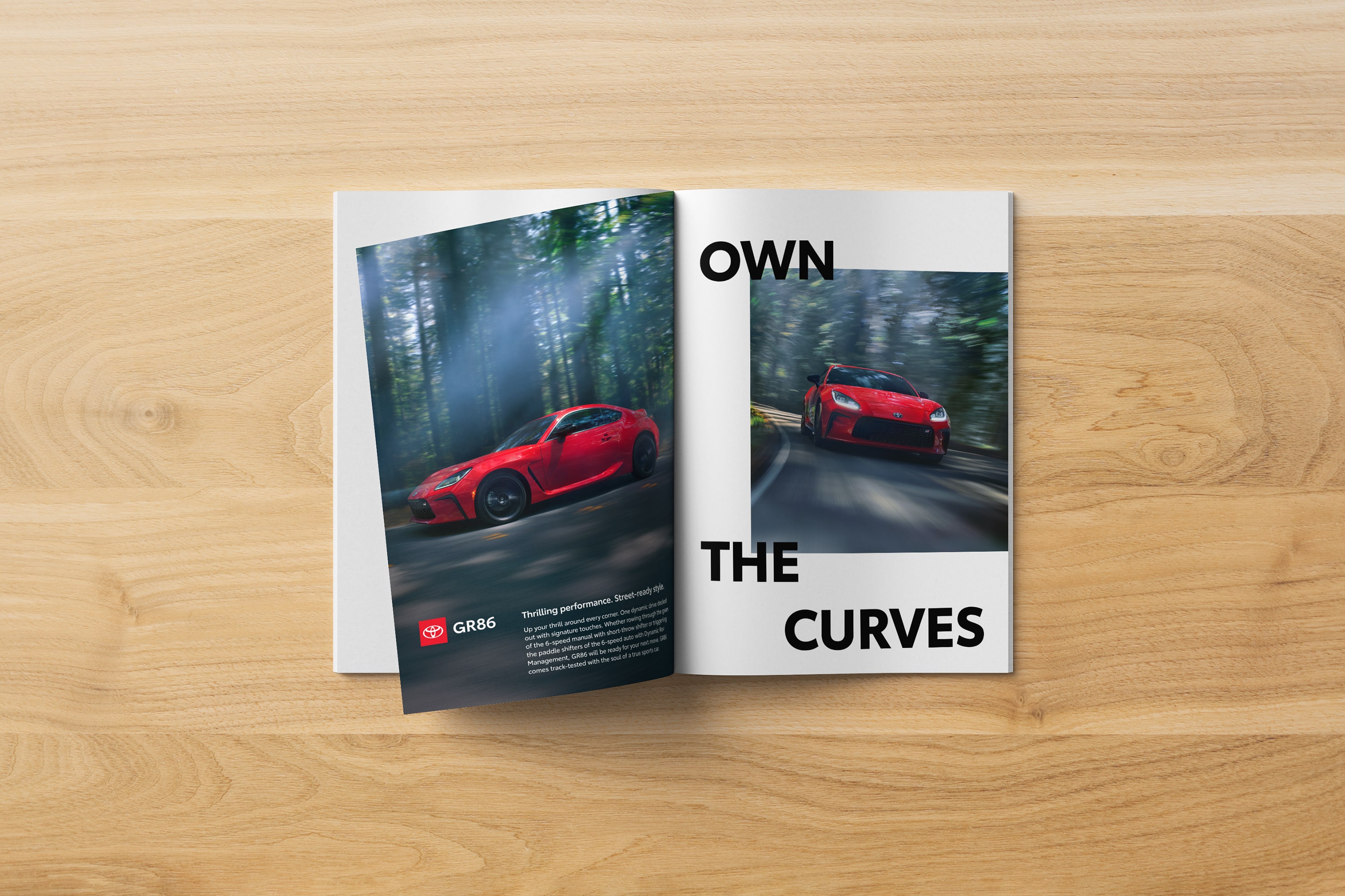
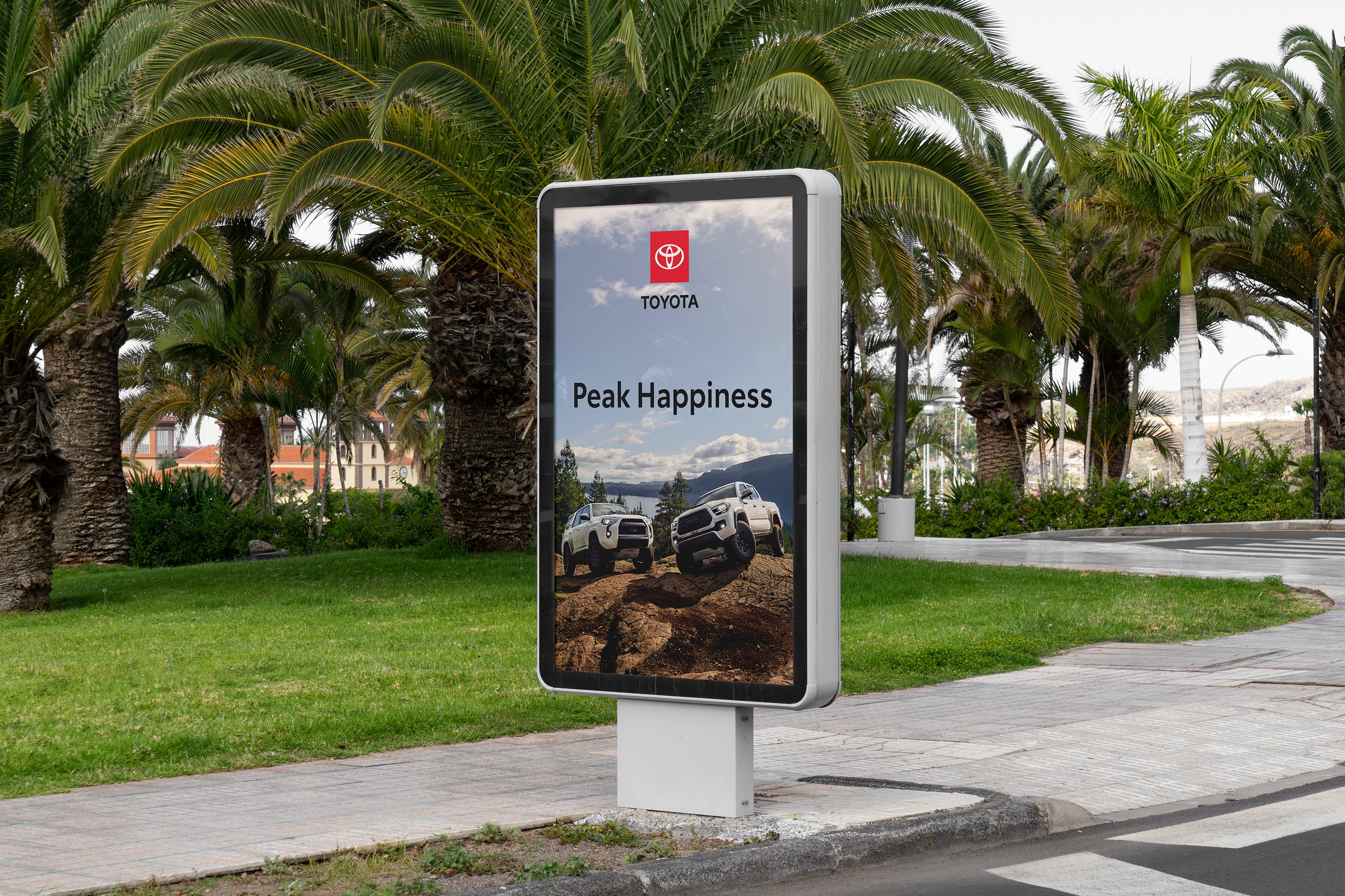
Iconic Execution
Creating a uniquely branded world leads to work that could only come from Toyota.
Emotional Connection
Focusing on emotional storytelling creates a more meaningful and memorable brand.
Consistent Application
Using brand elements with consistency reinforces our message and builds trust.
Iconic Execution
Creating a uniquely branded world leads to work that could only come from Toyota.